Solar Energy Consultants, who installed solar systems all over the country for some of the biggest brands, wanted a modern and powerful redesign to better represent them and their reputation in the renewable energy sector.

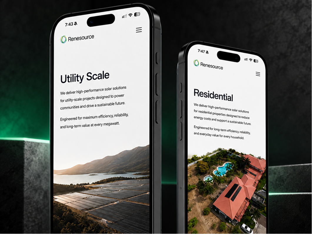

Renesource had a clear problem: the existing website was outdated, behind competitors, and wasn’t getting them new projects.
Redesign the entire website to reflect Renesource’s current status as an industry leader to clients and stakeholders.
Create clear conversion paths for potential clients to book a call or leave their details.
Redesign the entire website to reflect Renesource current status as industry leaders to clients and stakeholders.
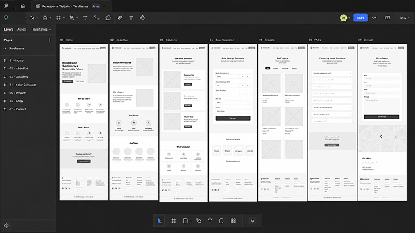
Competitor and search-demand research identified what prospective customers needed, where Buskowitz Energy, MSpectrum, and Solaric were stronger, and how Renesource could stand apart. Interviews with the Renesource team completed the strategy, which was translated into Figma wireframes and then developed in Webflow after approval.
The picture-superiority effect shaped a more visual presentation of Renesource’s scale and experience. “International experience” became an interactive globe, while animated statistics quantified the company’s impact. GSAP used scale, opacity, stagger, repetition, yoyo motion, ScrollTrigger, and an onUpdate callback to strengthen the business message.

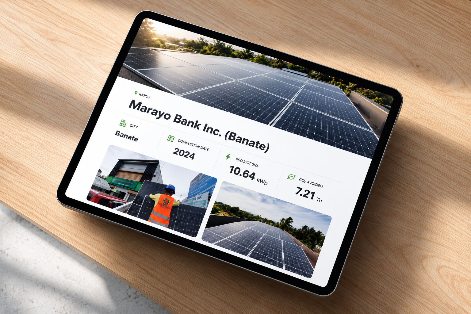
Structured Webflow CMS collections replaced manually rebuilt project and article pages. Future-ready templates preserved the design, while clearly named fields showed the marketing team what to enter and which page element each field controlled. Training gave the team full autonomy over routine publishing.
The solar calculator acted as a lead magnet. Custom JavaScript converted electricity bills into estimated consumption, calculated generation and system size, checked roof constraints, and returned projected generation, savings, CAPEX, payback, panel count, and required roof area. City-specific tariffs and peak sun hours adapted each result, while autocomplete applied the correct values automatically. AI assisted parts of the logic and implementation.
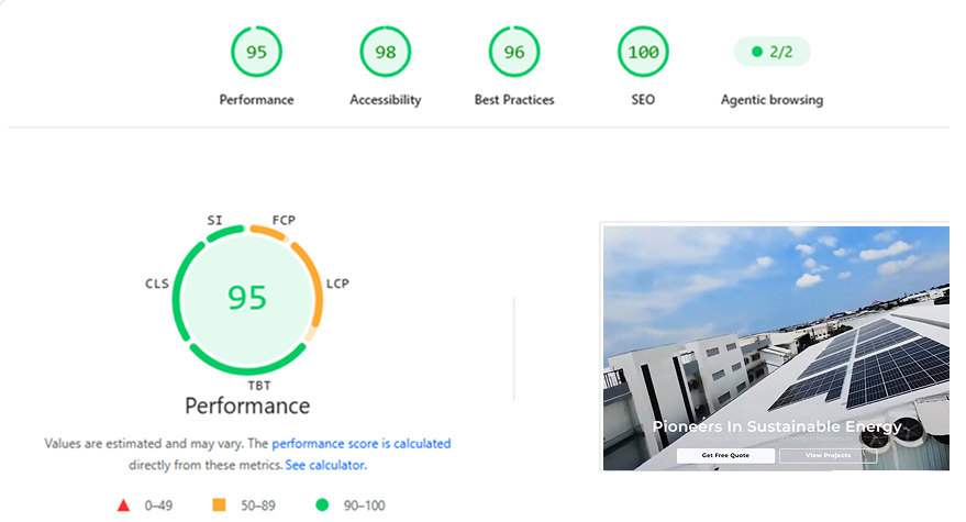
The site was refined for loading speed, responsiveness, layout stability, and interaction performance across devices. The calculator used ARIA tablist and tab roles, autocomplete and listbox semantics, complete keyboard navigation, and visible focus states. Essential content remained available without depending on animation.